We already know that savvy business people are turning back to the standard of
direct mail marketing
to cut through the clutter of a digital world.
Postcard-based direct mail marketing
is a tried and true method that’s seen a revitalization of its use in recent years, but there are other options for direct
mail marketing that shouldn’t be overlooked. One of these options is the
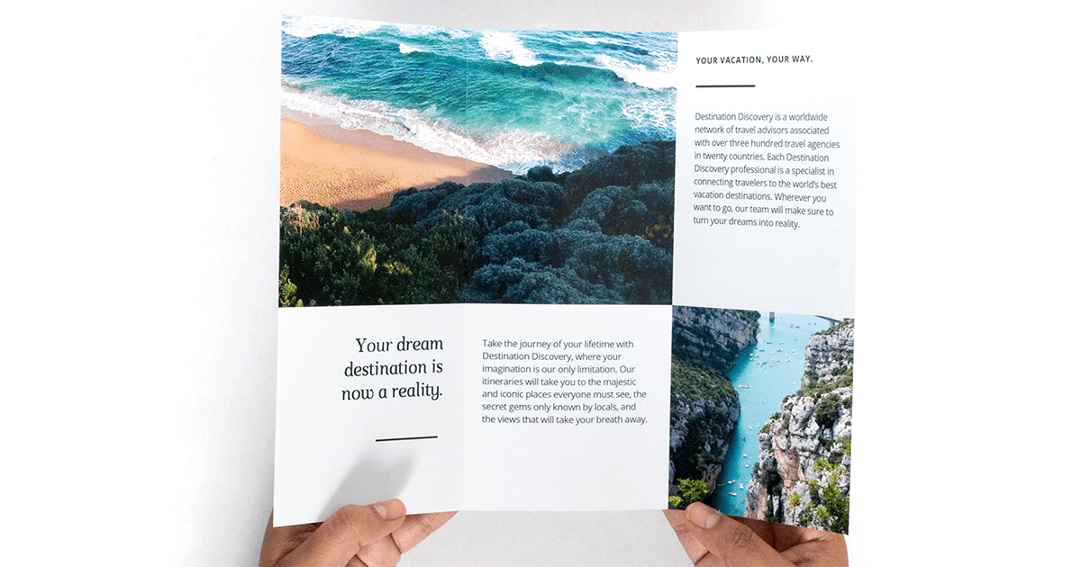
folded brochure.
Brochures are similar to postcards in that they’re unique, memorable self-mailer pieces that are cost-effective enough to
make mailing and distribution manageable. But they offer more space and more options than postcards, allowing them to carry
more information and even more impactful designs. This guide will help in creating that design.
The Basics
The
basic rules of designing a brochure
are much the same as the basic rules of designing a postcard. Designs should be clean and attractive and accurately reflect
the theme of the product or company they represent. It should strike a balance between conveying a message and pleasing
the eye of the viewer. It is of paramount importance that the design employs enough restraint, however, to keep from distracting
viewers from the principal message the design is trying to convey. The best designs strike a balance between visual elements
and content.
The Benefits of Extra Space
Brochures are larger than postcards and thus allow for larger designs and more space to deliver a message. As mentioned above,
this is the real difference between brochures and postcards, but it also creates the challenge of capitalizing on that
space. It’s important to keep a consistent theme throughout the piece regarding typeface, color and content, so as not
to break the continuity of the piece. Use the extra space in the brochure to flesh out the ideas that the brochure carries:
While a brochure isn’t a place to write a novel, it provides enough space to give in-depth descriptions of products, services
or events.
A brochure also affords you more space to add imagery, like well-designed art or photos. A balance of art and photos with
text and copy will create a more visually interesting and effective piece.
In short, let the space afforded by a brochure provide detailed and intriguing content alongside attractive design features
and images.
Don’t Forget Logos and a Call to Action
Some of the rules for postcard design apply to brochure design just the same. Designs should always include company logos
and contact information so that customers can follow up on information they find in the brochure. What’s more, brochures
should include a call to action, as postcards and other mailing pieces do. Calls to action in brochures don’t have to be
just like those in postcards, though. Postcard calls to action will always center on coupons, rewards or discounts. Brochure
calls to action can be a bit more subtle; sometimes a simple “Visit us at x-website to learn more” is enough of a call
to action to steer customers, especially if the brochure’s design and content have already done enough to spark interest
in the company it markets for.
Remember, for mail brochures, there must be enough room for
postage indicia
and the address area, so account for those spaces in the design. Refer to our
mailing guidelines
for more info on USPS-friendly brochure layouts.
Work with Quality Printers
The final step to a great design is having it printed on quality paper by experienced professionals that care about your
success. As always, U.S. Press is standing by to make your design happen and help your business succeed on its next marketing
campaign.